How can curators draft engaging labels, without distracting visitors with too much information about the objects? In part 1 of this post, Lucy Harland writes about the fine art of signage.
Image: Visitors at the Rijksmuseum in Amsterdam | Photo courtesy: Lucy Harland.
If you’ve ever visited a museum, it’s almost certain that you have read an object label or a text panel on the wall. But how many of us who write those labels and texts (signage, as we curators call it) actually stop and think about whether we are doing our best to help visitors understand the objects? Are we writing in ways that are interesting and engaging? Do we capture visitor interest and spark a desire to learn more about the object, the collection and the museum at large?
Curators and exhibition developers are thinking more carefully about the labels and texts that they write, conscious of the fact that written text is one of the key ways in which museums ‘talk’ to their visitors.
As an interpretation consultant for museums, I help curators and museum staff to create exhibitions which communicate clear ideas and messages to their visitors. I often work with exhibition teams who are writing museum text, and many of them face the same challenges.
What makes a good text label?
Imagine a curator giving a guided tour of a museum to visitors, sharing their knowledge in an engaging style that inspires and interests the listener. They will pick out details to look at, describe why an object is important and explain how it represents significant cultural, historical or scientific events. Hopefully they will convey some of their own fascination and enthusiasm.
For me, text in museums should be grounded in the curator’s expertise, shared with the same enthusiasm, delivered using words and expressions that the audience understands and finds interesting.
Labels and graphic panels at the newly-reopened Rijksmuseum in Amsterdam have a clear and confident voice. Some of the language is aimed at a well-educated audience but this is presumably one of their core visitor groups. What I like about these texts is that the writers’ enthusiasm for the subject comes across very clearly.
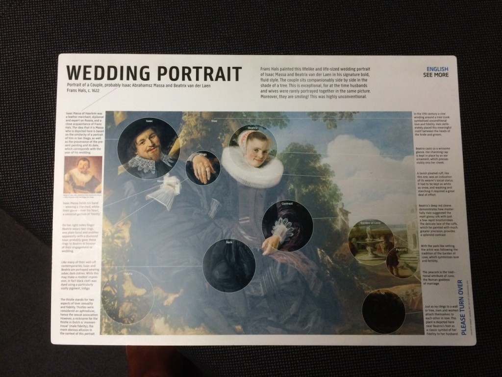
Image: ‘Wedding Portrait’ handout given to visitors at Rijksmuseum, Amsterdam
Anyone writing museum text also has to remember where it’s being read. In busier museums like the Rijksmuseum, people are sometimes jostling for space and only part of their attention is focused on reading text. Imagine trying to read complicated text in this environment.
The other critical thing to remember is that your text can’t do everything. At the Rijksmuseum, they have used a simple large laminated handout to explain all sorts of intriguing details and symbols in some of their more famous paintings. Visitors can read the text and look at the painting before returning the sheet to a holder in the gallery – the large size and slightly hard laminated surface mean that they are less likely to slip the handout into a bag and take it home, intentionally or not!
About the Author
 Lucy Harland is a museum interpretation consultant working with a range of UK and international clients. Lucy has a particular expertise in exhibition planning and museum text writing and editing. She was formerly a museum curator and a BBC radio producer. Follow her on Twitter.


Thank you very much ReReeti for all the great information about museums that you send to us. Regards.
Brevity!